Disclaimer: I use RAW format in camera with as neutral as possible pre-defined settings. Instead of letting the camera chose what it thinks are the right settings, I adjust them myself in Adobe Lightroom and Adobe Photoshop. This way I can fully control how the final image will look like. For me this is always either a representation of how the scenery looked like to me, enhancing a particular atmosphere in it, or a mix of both.
This photograph is captured above Vallehermoso in La Gomera, Canary Islands. The high peak in the center is Roque Cano. This is a 67 seconds exposure, done with a 10 f-stop neutral density Lee filter (they call it the "Big Stopper"). I used a long exposure to capture the movement in the clouds. Below I show the main steps of how I processed this image, but first a comparison between the initial unprocessed capture and the final result.

The original photograph straight out of camera.
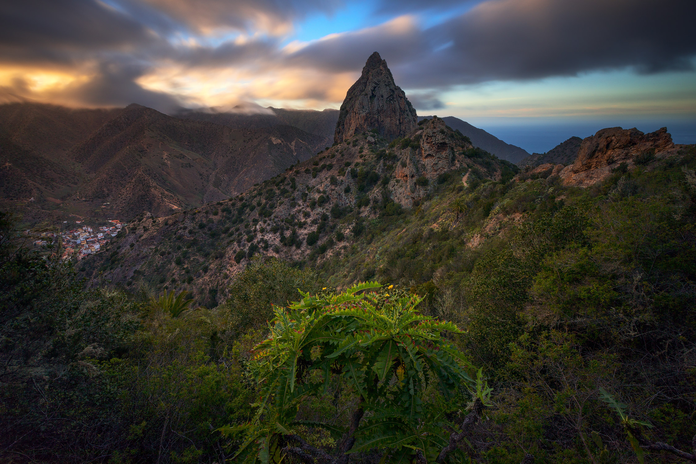
The final result.
I will now show the main steps I did in the development process. The photo is a blend of two versions of the same file. This means that I developed one version for the landscape and one for the sky in Adobe Lightroom. Then I mixed (in other words blended) both in Adobe Photoshop to turn it into one image. The development in Lightroom is a wholesome process which lets me decide the initial look of the image - regarding how dark or bright the image will be, how much color it will have, how much contrast it will have and what tone the color will be. There are other smaller details involved in this process as well, like how sharp the image will be and how much vignette it will have.
Even though I developed two versions of the same base image (sky and land), the difference between them is not really that big. Basically, one is darker (the ground) and the other is brighter (the sky).
Here is how they looked like. First image is for the sky, second for the land, and the third is both mixed into one:


Since the land image shows most detail, it probably is most valuable to see the Lightroom processing of it. Here are my main manual adjustments for it:

However, as you saw at the beginning of this article, the image was really dark and mostly just showed details in the sky. This was the initial capture of the camera. The sliders called "Blacks" and "Shadows" in the main tab above is what reveals these hidden colors and details. This is something that only newer cameras can do really successfully, and is actually quite astonishing technically. When I was shooting this scene, I made several exposures just in case this darker one wouldn't cover enough detail. But luckily I didn't have any use for them.
Before I continue, I would like to point out one thing regarding blending of images. There are automatic processes for this, but I prefer doing it manually. The reason for this is that often the difference between the sky and the land will be very different. This is always related to that the sky shows more light than the ground. Our own natural eyes don't see this difference in real life because we can perceive a bigger range of contrast. A camera can't do this by default and that is why we use such tricks as exposure blending. Blending has to be done carefully to preserve the natural feeling.
For this reason I created a natural transition from sky to land. The blended images have to meet somewhere, right? We can call this a "transition zone" - where one image overlaps with the other. This zone can be very specific and thin, but it will also look less natural and be too easy to spot for our eyes. This is what automatic blending processes often do. The trick of any such blend is to make it as natural as possible. Anyone who is looking at our photo shouldn't be able to point at it and tell us where we did the blending. For this reason I like to let both zones overlap a bit to create a smooth transition.


There are several ways how to create a more natural and smooth blend of images. The easiest is to use layer masks in Photoshop (it may feel very tricky if you haven't used them before, but the principle is extremely simple - I will explain them in a future article). For now, I will just quickly describe the layer mask process I did. First I created a very basic layer mask to blend the two images. Then I placed a second layer mask (by using layer-group) on top of it to fine-tune the blend and create a natural transition.
Okay. So now I have one final blended image to work with. All the basics are done. At this point I often like to look at the image and try to identify two things:
Question 1. What is wrong or lacking in the image?
Question 2. What do I want to show with the image?
Remember that so far we only have an image which represents the technical capability of what the camera has captured. All the elements I add in the following steps can in theory be done by the camera as well, but what the camera can't do is specifically define and tweak where, what, and how much of it will be applied. That is what Photoshop is for.
After considering the image a few times I decided that there is a lack of light in it. The center of the photo is lighter than the rest and for the photograph to make sense, there needs to be an explanation for this. For this reason I added a boost in light on the left side, just below the clouds. I simply painted a bright warm yellow tone, my paint brush set to 10% opacity, set in "soft light" mode.
Introducing a sense of light and its source
Next I wanted to make the image bloom in color. My favorite method is by darkening the image, but only in carefully selected areas. I use luminosity masks for this, generated by Tony Kuyper's panel, which is a plug-in tool for Photoshop. These masks let you target very specific areas. For example it can help you only adjust the strongest blue tones. Or the lightest parts of the whole image. Or the lightest parts of the strongest blue tones. Technically it can help you target anything you want. Just to show you an example, I used a mask targeting only the midtones of the image, to boost contrast. I first created a curves adjustment - a so called S curve - which is a very efficient and simple way to boost contrast in a photograph. It looked like this:
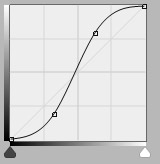
A so-called S curve
To make it, just move the line around. This sort of adjustment, when uncontrolled and unlimited, will add way too much contrast to the image. I didn't want the lightest and darkest parts of the image to be affected at all. My target was only the blank tones. You can think of it in terms of black and white. If I turned saturation down entirely on this image, making it purely black and white, the darkest parts would look pretty much black, and the lightest would look mostly white. Everything in between black and white is a shade of grey - otherwise called "midtones". (Actually if you get this, you already are understanding the principle of luminosity masks). So, through Tony Kuyper's panel I generated a mask only targeting midtones - the most grey tones in a black-and-white simulation of mye image, and applied it to the curves adjustment shown above. Behold the difference:


I did a few other similar adjustments targeted at specific parts of the image selected through luminosity masks. There is otherwise for me usually no need to add saturation or boost in specific colors as the development I initially did in Lightroom (the very first steps) already adds enough color richness.
Next I would like to address the color tone. I often think in terms of color theory. This theory tells us which color combinations feel natural and pleasant to look at. A landscape photographer Ted Gore has a great article that explains it, look it up! My favorite thing to do is look for natural color contrasts and then make them stand out more. In this image I noticed a fresh and vibrant tone of green, blue and yellow. The image for some reason made me think of a lemon with green leaves hanging on a branch, with a blue sky framing it in. So I decided that I want to make these color tones pop a bit more. I used color balance tool in Photoshop to adjust the color tone in my desired theme. The picture, as you can see above, already has a warm tone. Therefore I decided to bring forth a stricter blue tone in the sky and also add a tiny bit of it overall. It is all about minor adjustments and details. In addition to color balance tool where I switch the tonality of yellow-blue range a bit more towards blue (about 5-10%), I also used the following two effects on Tony Kuyper's panel. "Neutralize Color Cast" is an automated attempt to balance the colors, which then is controlled by a luminosity mask of my choice and "Color Luminosity" tool which opens a panel which allows you to adjust the brightness of color tones. In the latter I only gave a little boost to the blue and teal tones to brighten the sky where there were no clouds.


A good way to find a pleasant color tone contrast is to adjust the counterparts of each color range across shadows, midtones and highlights. As you can see above in color balance I switched +7 towards blue on the midtones, but then I clicked on highlights (not shown here) and switched the same color range with 5 towards yellow.
After a bunch of such adjustments which affect the brightness and tonal values of the photograph and when I feel that the picture is getting where I wanted it to be, I like to take care of smaller details. Especially due to darkening, some inconsistencies might start showing up. In my case here, the Roque Cano mountain was right where I created a transition between the two images when blending them. What was previously more neutral, now suddenly appears darker due to above mentioned adjustments, and I need to take care of it.


Something that I almost always do in my images is clarity sharpening. I usually apply a not so fine sharpening value on Adobe Lightroom, because the process I do in Photoshop later takes care of the finest details. I use Tony Kuyper's panel where I run the "Tonal Clarity Darks" action and I usually add somewhere between 3 and 10 of value to make it as subtle as possible. After a process like this it is important to remove the effect from the sky, clouds and other smooth surfaces as they either get enhanced noise or appear weird and rugged. Can you see the difference?


It may not be very visible here, but the final image when saved for web appears quite sharp on the finer details. This is of course a matter of taste and some may criticize that the image is too sharp, while others again wouldn't mind even more sharpness.
I am getting close to the finish line here. I will be honest, some times I spend days on developing the same image. Fortunately I am never really in any rush. I prefer to look at the photograph and reconsider it every morning with fresh eyes. What seemed like a fine saturation yesterday, may look absolutely horrendous and unnatural later. And what seemed like a fine contrast boost, may look blank and boring the next day. In the case of this specific image, I during my last consideration decided that it needed a contrast boost as I felt it wasn't expressive enough. I often like to use levels adjustment in Photoshop to correct that.
Final levels adjustment
Which leads to the following final change.


Some of these adjustments may seem quite small. But over the course of this development process I gradually change the image and constantly re-evaluate it and reconsider if I am still expressing what I want with it. Together they bring quite a change and you only need to look at the earlier version at the top of this article and compare them with the final result above on the right.
Some final words: there is never one way to correctly develop an image. At least I believe so. During a different time, maybe even just some days, weeks or months away from now, this very same image might have turned out very different. Similar to a painter or a writer, we express ourselves, only more with colors and light, and this very part is affected by what we are experiencing and feeling during a specific time. For this reason I think we should try to get lost in the process of developing photographs, to experiment and try new things. A well processed image is a mix of your technical knowledge (the brain) and the emotion or atmosphere you want to express with it (your gut feeling - the heart).